
Digital product teams face a binary choice with iconography. You rely on free open-source packs and accept their limits, or you build a custom set and drain your design budget.
Table of Contents
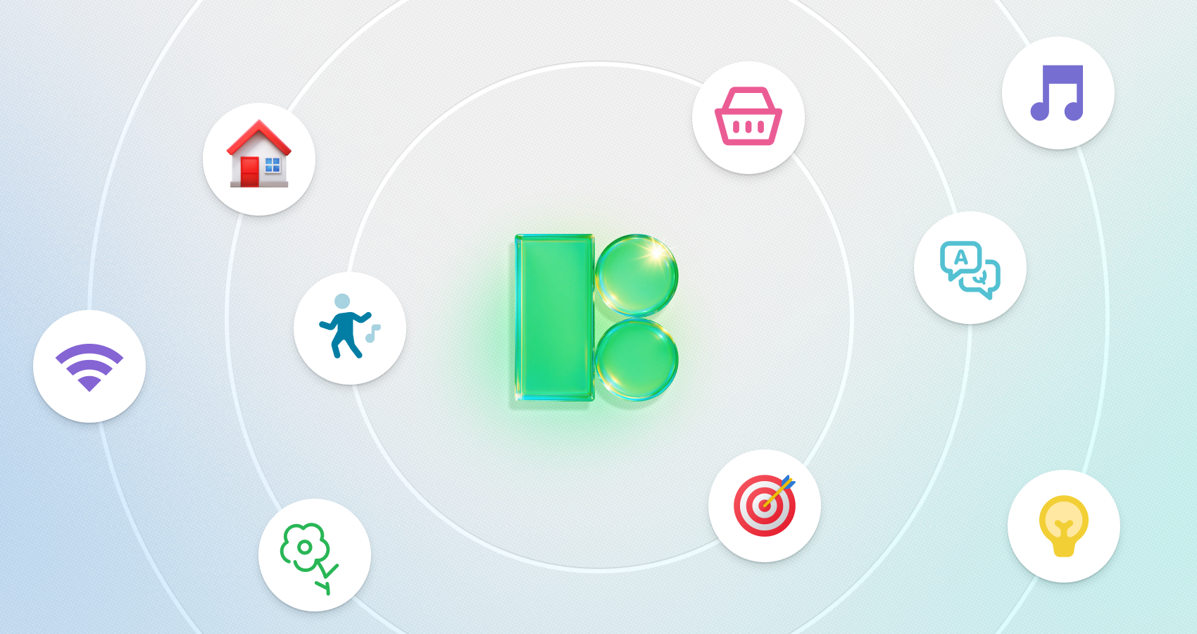
Icons8 Icons offers a third path: a massive, centrally managed library. The real value isn’t just volume-though 1.4 million assets is substantial-it’s the strict adherence to design systems. For teams needing visual unity without a dedicated iconographer, this bridges the gap between generic freebies and expensive custom work.
Solving The Consistency Dilemma
Third-party assets often create a “Frankenstein” UI. You find a perfect “Home” icon in one pack, but the “Settings” glyph looks wrong next to it. Grab a replacement from a different library, and suddenly line weights don’t match. Corner radii clash.
Icons8 fixes this by guaranteeing depth within styles. If a style exists-say, “Material Outlined” or “iOS 17 Glyph”-it covers over 10,000 concepts. A designer can start a project in a specific visual language and finish it without switching libraries just because a niche asset was missing.
Workflow Scenarios
Different roles interact with the library in unique ways during a project lifecycle.
The UI Designer Prototype Phase
Picture a UI designer mocking up an iOS settings menu. Speed matters. Instead of drawing from scratch, they open the Pichon Mac app or Figma plugin. They select “iOS 17 Outlined” to match Apple guidelines.
Generic concepts like Wi-Fi and Bluetooth drop right in. Then, a stakeholder asks for something specific, like “biometric security.” Because the library is vast, the designer finds that niche icon with the exact same line weight. If the project shifts to dark mode, swapping the selection to “iOS 17 Filled” takes seconds. Consistency stays intact. No manual tweaking required.
The Developer Implementation Phase
Frontend developers often get stuck waiting for assets. They need code-ready formats, not vector files they can’t open.
With Icons8, the developer logs into the web interface and accesses the collection shared by the design team. No emails asking for exports. They use the bulk export tool. “SVG” works for web components, while “Lottie JSON” handles animated onboarding elements. Even if the brand color shifts, they don’t need new files. They apply a bulk recolor using the new HEX code in the browser before downloading.
A Day In The Life: The Marketing Sprint
A content manager needs a slide deck for a quarterly review. The deadline is tight. Design is booked.
They open the Icons8 site looking for visuals that avoid the “clip art” look. “Plumpy” or “Hand Drawn” styles keep the tone friendly. A search for “growth” brings up arrows and charts. They pick a rising graph.
Next up: “teamwork.” They upload a rough whiteboard sketch to the search bar. The AI finds a matching composition in the library.
The default black outline looks harsh against the slide background. Clicking the icon opens the in-browser editor. The manager changes the stroke to navy blue and adds a square background element for weight. A quick download of a high-res PNG finishes the job. Three minutes, start to finish.
Integrations and Embeds
Downloading files isn’t always the right move. The platform provides CDN links and Base64 HTML fragments, perfect for rapid prototyping or CMS environments with upload restrictions.
Social contact sections are a prime use case. You need logos that match your interface, not the chaotic mix of official brand colors. Building a footer? Grab a specific whatsapp icon that matches the style of your Twitter and Facebook assets. Recolor the official logo to white, grey, or your primary brand hex directly in the tool. The footer looks cohesive, not like a billboard.
Comparison With Alternatives
Here is how the tool stacks up against common competitors.
Vs. Open Source (Feather, Heroicons):
Developers love open-source packs. They are free and lightweight. But they usually cap out at 200-300 core icons. Need an icon for “sushi” or “cryptocurrency”? You’re out of luck. Icons8 wins on volume.
Vs. The Noun Project:
The Noun Project functions as a marketplace. It hosts millions of icons, but styles vary wildly. Finding five icons that look like they belong to the same family is a chore. Icons8 creates a single-source library, keeping styles curated and consistent.
Vs. In-House Design:
Internal design offers ultimate control. But maintaining a set of 500+ icons eats up staff time. Unless iconography is a core brand differentiator, subscribing is cheaper and faster.
Limitations and When This Tool Is Not The Best Choice
Trade-offs exist. Consider these before committing.
The Paywall for Vectors:
Free users get limited access. You can download PNGs up to 100px, but that won’t cut it for retina displays or modern web usage. Production requires SVG vectors, which means a subscription. You can’t buy a single icon.
Rigid Styling:
With 45+ styles, you still play in their sandbox. Want “Material” style but with slightly different corner radii? Too bad. You can’t tweak vector paths inside the web editor. You have to download the SVG and edit it in Illustrator or Lunacy.
Attribution:
Free plans require a link back to Icons8. Commercial client projects rarely allow this, essentially forcing an upgrade.
Practical Tips for Power Users
Integrate these practices to save time:
- Use Collections for Bulk Actions: Stop downloading one by one. Drag everything into a “Collection.” Recolor 50 icons instantly and download a sprite sheet or SVG set in one click.
- Request Missing Icons: Hit a dead end? Use the Request feature. It actually works. If a request gets 8 likes, they draw it.
- Check “Simplified SVG”: Keep this box checked for web use to reduce file size. Uncheck it if you plan to edit paths in Illustrator, as the simplified version merges shapes.
- Use The Plugins: Figma and Adobe CC users should install the plugin. Dragging a vector directly onto the canvas keeps you in flow better than browser switching.
Icons8 Icons serves teams that value speed over artisanal asset creation. It removes the overhead of managing an internal library and prevents the visual chaos of mixing free internet assets.